So just what is typography in web design?
In the simplest of terms, typography describes the creative design of text on your web pages.
It includes such stylized aspects as letter design, kerning and leading.
While we often don’t give much thought to what fonts are being used by our favorite brands, the fonts we choose do much more than deliver your carefully-crafted brand messaging, they evoke strong, emotional reactions.
Why Typeface and Font Choice is Important
The reason that typeface and font choice is so important for your brand or company is that you want your fonts to evoke positive emotions and provide easy readability at the same time.
With those two criteria driving your font choice as well as your font pairing, let’s discuss some other important factors you’ll want to consider.
Aside from considering the emotions and readability of your font, the next factor to consider when choosing fonts is your industry.
Why is your industry so important? It will dictate whether you choose a fun, casual font or a more serious, professional one.
If you’re a professional IT firm, you might want to choose a modern, more professional font. If you’re an online retailer targeting teenagers, a casual, fun font might perfectly suit your brand image.
Get your website score, use our website cost calculator, get an SEO audit and more with our free website tools!
Try for Free
Fun Versus Professional Fonts
Let’s examine a few examples to help convey the meaning of what a fun font is versus a professional one to help guide you in your decision.

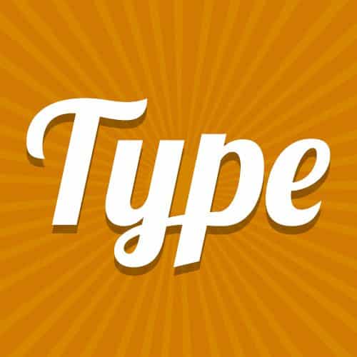
Take the Pinterest logo, for example – it is a more casual, scripted font that conveys friendliness and fun, which are the perfect emotions that the image pinning site likely wants to elicit from their primarily female, creative audience.

Now, let’s take a look at the logo for a more serious company, such the following IT managed services company as mentioned earlier.
This company uses a more straightforward, modern font that evokes less emotion and conveys a more professional tone, the perfect feel for an IT managed service company.
Now that we’ve covered what some would consider a casual versus a professional web font, let’s review what else your brand guidelines should include – a font pairing and the instances or scenarios those fonts should be used. Often times, companies will use two or three fonts throughout their website.
Working on creating your own website? Be sure to follow these 5 rules and best practices.
Pairing Visually Appealing Fonts for Your Website
You might be wondering why you need more than one font for your brand and website.
And, you may not need one, depending on your industry or if your website and marketing materials are more image centric than text centric, such as on online retailer that focuses on product image versus descriptions.
But, by adding a second font, it often does help to provide visual cues to what information the text offers and easy readability.
In the instances where two fonts are used, companies typically use one font for headers and the other for body copy.

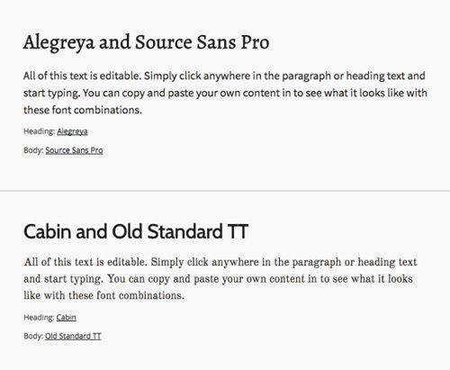
In the example here, the headline utilizes a serif font and the body of text, or paragraph below the headline, a sans serif font.
If a third font is used, it might be used in sub headers or a CTA (Call To Action) button to visually cue the reader that there is a link to more information.
In essence, by using different fonts, you can make pages with a great deal of copy more visually appealing and readable and is simply a result of good typography.
Now, where to begin when choosing a font pairing?
The good news is there is an easy rule of thumb when it comes to a font that can help you guide you in your decision; choose a serif and a sans serif font.
A sans serif font is a font without the use of a serif, which is a stroke added to each character or number.
To help demonstrate what stroke is and how to identify a serif font versus a sans serif font, the fontpair.co site pairs the fonts together.
As you can imagine, in instances where you have a great deal of copy a good font pairing improves readability and provides that visual cue for the type of information that is within the text.
If you’re not sure where to begin, your graphic designer or the firm you’re working with should be able to help in this area with a few recommendations.
Is your website outdated, ugly or difficult to use? Partner with us and get your business site ready for 2022 and beyond.
Resources to Help You Choose the Right Typography
If you’d feel more comfortable doing some research yourself, this post by Visme is a great place to start.
They provide several images that play with various font combinations, font weight – which pertains to letter thickness or boldness – or sizes.
If you’re more of a visual person, here’s a couple of other great resources to help you get going:
Font Squirrel is a great site that you can visit to download fonts that you need or search for fonts based on common search descriptors, like grunge or elegant. You can also look at categories like “what’s new” or “hot,” which are also good to check out because there are always fonts that are trendy, new or popular for certain industries.
Google Fonts is another great place to start that allows you to search by criteria like serif, sans serif or handwriting. It provides a visual display of each font, including what each font looks like in a paragraph, in the alphabet or as a numeral. You can select a few fonts that you like and view them paired together.
In Summary
The fonts you select are important to supporting your brand image, your website readability and providing visual cues through text.
If you’re not sure where to begin, check out some of your competitors or give us a call at AWEBCO.
Not only are we great Illinois web designers, we love to share our passion for design and typography.
We’re happy to help guide you in selecting your color palette and font choices for your website.
Frequently Asked Questions About Typography on the Web
Here are some of the most frequently asked questions about typography on websites and in the digital marketing space.
What is typography in web design?
Simply, typography describes the creative design of the text on your web pages. This includes the font pairings you choose as well as stylized aspects such as letter design, kerning, and leading.
Why is typeface and font choice important?
Typeface and font choice are important for your brand or company to evoke positive emotions and provide easy readability at the same time. The industry you’re in should also influence your font choice, as well as your target audience.
How many fonts should you use on your website?
Generally, on websites (or just about any publication) you will want to use no more than 3 fonts. Any more will clutter the website, make it more difficult to read, and make it harder to discover your calls to action. Using italics and bold adds more variation to your font choices as well.
What are the different classifications of typeface?
There are 5 basic classifications of typefaces:
- Serif – A finishing stroke on the ends of letters on certain typefaces (Times New Roman, Georgia, Garamond, Century, etc)
- Sans-Serif – The opposite of a serif font; does NOT have a finishing stroke on the ends of letters on typefaces (Arial, Helvetica, Geneva, Product Sans, etc)
- Script – Typefaces that imitate natural handwriting and cursive, generally used for display or trade printing (Alex Brush, Pacifico, Allura, etc)
- Monospaced – Each letter in a monospaced typeface takes up the same amount of space on a horizontal line of text (Courier, New Courier, Lucida Console, etc)
- Display – Display typefaces are designed and intended to use in large sizes, such as headings, instead of paragraph text (Stencil, Rosewood, Magneto, Collegiate, etc)


2 Responses
You provide great information on font combinations and pairing. I really enjoyed creating the Courier Font combination with Helvetica Font in the sans serif category. I have a website where you can download fonts and use them for website designs.
This is an awesome article. There is very helpful information is provided in this article that is necessary for web designing. Fonts make the website attractive.